Monday, 24 December 2012

"Piped" Rough

So I ended up taking the factory design from Thumb #1 and the framing from Thumb #6 (see below)
to create this guy:


From there I put a new sheet overtop and put everything in proper perspective to come up with this:


When I clean this bad boy up I may leave some of the details out or draw them very faintly. Although I wanted this environment to feel cluttered it still needs to be readable.

Have a Merry Christmas!  

Wednesday, 19 December 2012

Semester 1 final and more!

Hey blogland! Schools been kinda crazy so I haven't been able to post much recently

Our final Assignment was to draw a character rocking on on Guitar:

http://www.youtube.com/watch?v=ZvJk0faR9R8

Posing was definitely the most fun on this project. I'm also going to try and pump out a couple of pieces for my portfolio over the break. And will post some pre-production/finals here

The first thing I chose to do a establishing shot for a Fossil Fuel Powered City (based on an idea I had previously in the semester.) Here's where I'm at so far!


I'm going to get some feedback, then rough one of these guys out and clean it.
Till then!


Thursday, 22 November 2012

Imperial City Pan!


So here's my pan assignment we've been working on for the past while. I almost killed myself on this one, but I think it was worth it. I hope you enjoy!

Sunday, 28 October 2012

More Pan Thumbs!


I had a blast coming up with these. One of the nine I'm going to blow up and fully construct. I'll post it when it's ready!


Some funky values! ;p


Sunday, 14 October 2012

Experimenting with Pans


I tried a bit of a new process with these guys.

First I laid in some tonal values with markers. I was concerned with  trying to get forms to read one in front of the other as well as creating depth with atmospheric value (Darker in front/lighter in back)

Then I took a pen and added more finite shapes and details. And Lastly went over them again with another pass of value markers.

Not sure if this is the best way to work for me, but it was a blast to try!


Rough Chime BG and Anatomy!


So this is pretty much the end result of my BG. When I clean it up I'm going to simplify the rocks because there a little bit distracting as of right now.

For this anatomy assignment we shaded a model in class then had to draw the bones, then muscles over top. I decided to add a little bit of color. Not the greatest render ever, but I had fun!

Friday, 5 October 2012

Environment Design Part 2


So I had these two selected by my teacher of the 17 below. I had to do some revisions to make them into better film shots. My biggest critique was making sure there was enough negative (empty) space around my subject matter. More neg space means it's easier to read visually!

So of the 2 above I've selected #2 "Chime" to blow up and completely rough out and then clean. Once thats done I'll post them both!

Thursday, 27 September 2012

Environment Design

In school we have been given an assignment to draw a 3-point perspective background. I took it as an opportunity to play with composition and expand my visual library amongst many other things. Hope you enjoy! 


The next stage is to refine 2 of these, then to pick one to blow up and fully construct. I'll post as I complete each stage!

Sunday, 9 September 2012

Lich


Because who doesn't want the power to raise dead minions? 

More Minotaur!

Just felt like drawing something angry today, what else is new? :p


Thursday, 6 September 2012

House Shapes

I'm happy to say these were inspired by Life. There is a house vey close to mine that is made of like twenty different shapes haphazardly stuck together. I've walked by it for 2 years and just realized yesterday it has a spire. Super cool! So i asked myself: "What would this look like in a fantasy world?" 


I drew my "refrence house" then essentially took it apart and rearranged it's pieces and details to come up with these 3. I like the one in the middle more than the other two, but they were all fun to create!   


Monday, 3 September 2012

Schools Tomorrow!

With school just over the horizon, I'm trying to use what time I have left to bust out a few drawings!

Maggot King 
(inspired by a Hercules Beatle Larvae)


Fury, The Enraged
(5th in the Saga of the 7 deadly Sins)  


Hope you enjoy!

Wednesday, 29 August 2012

Famine and his Locust

Famine is one of the four horseman of the Apocalypse. 


Although his name is open to interpretation I decided on a "Locust"theme due to there roll in devouring crops. I tried to repeat the locust shape on his pauldron  as well as on his pelvic armour. I also tried to repeat the same kind of spikes beetles have on their arm on his shoulder piece/knuckles

Monday, 27 August 2012

Walking Hive

"I think I can deal with a few killer wasps..." Said the cocky adventurer. "It's not the wasps you should be afraid of, it's the hive."


Sunday, 26 August 2012

Schools coming, better draw some creatures now!

I've been trying to think more about my design so I'm going to drop a few points on why I did what I did.

Aggressive Insect 

1. Legs in the back are bigger because they are holding most of the weight.
2. Spiky carapace over soft abdomen for protection 
3. Multiple textures for intrust and believability 

Tree Powered Golem

1. Droopy head to show age
2. Short legs to keep him low and make him feel heavy
3. Edge control on the stone to give it more feel

Hope you enjoy!


Saturday, 25 August 2012

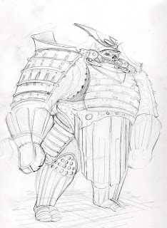
Samurai!


Overall this summer one of my biggest goals was to expand my visual Library, which means exposing ones self to lots of different subject matter! For the past little bit I've been looking at Samurai armour. You can't beat the classic cool of a Samurai warrior :p 


First I pick apart there armour with my pencil.


Then I try and have some fun with it!


Sunday, 19 August 2012

Skeley and Sphere


Getting More familiar with photoshop. With this one I used a reference sphere to help me with value placement. 


Monday, 13 August 2012

Cave City

I decided to challenge myself to produce 8 thumbnails for a "Cave City" Overall I am happy with how these turned out. My main goal was to 1up the temples I drew earlier this summer as well as play with composition/perspective. 


My End goal is to take one of these (leaning towards number 6) fully construct it and then digitally paint it in black and white. 

Monday, 6 August 2012

Value, Creatures and Buildings!

So I spent the last week chillaxing at my cottage and doing some drawing stuffs.


Part bug part lizard this guy blends in quite well with his swamp environment due to the dead wood shapes on his hide.


I also did a couple value studies of which this one turned out the best. It still has a lot of rough patches, but over all it's better than my earlier studies


Heres some building designs I came up with. I'm trying out different shapes in the hopes of finding something distinct and interesting. Also a little pen study in the top left.


I'm also trying to make my thumbnails count for more and get a little more detailed with them. For this creature I went with the bottom left idea.

Thursday, 26 July 2012

Wasp Humanoid Theme


So it took pretty much every fibre of f my being not to pile on muscle for this one. With this girl i was trying to get a good contrast of big shapes vs little shapes. I also worked with the gesture for a while till I was happy with the flow/tension.

Sunday, 22 July 2012

Creepy Crawly


I was inspired by those spiders that have the three pointed Abdomens. I wanted to try and make this monster feel aggressive and fast, but not all that protected. Hope you enjoy!

Saturday, 14 July 2012

More Japanese Architecture!


So this guy was lots of fun. Still working on making things pop with value. For the next one I'm going to aim to make a painting tight that stands without line.

Tuesday, 10 July 2012

Sketch!

Hey ya'll! Between work and a commission I'm working on (more on that later!) I haven't had a whole lot of time to draw for myself, but heres a chinese villa in the Mountains! 


Working mainly on Composition and Focus. Major things. 1. Foreground mountain and bridge both boxes and brings us into the shot. 2. the flow of the further mountain villa brings us into the focus on the right. 3. I t put the strongest value contrast on the villa on the right (enhancing the focus) and  although I think it works, It definitely needs a lot more tweeking. Baby steps!!!!!!!

Wednesday, 4 July 2012

Something smells fishy!

So the idea for this creature came from a friend. We were doing some table top gaming and made a series of choices that eventually lead to us feeding a pack of mice sausages in order to see how they would be affected. Inhuman you say? I agree! That's why gamings awesome :)

I would explain the context, but I also need to get some sleep for work tomorrow so maybe another time!


So this little guy is somewhere between a mouse and a three jawed fish monster. Hope ya like!

Wednesday, 27 June 2012

Tuesday, 19 June 2012

Some Fundamental Stuff


So here's where I'm at with value now. My goal is to have a much stronger grasp by the end of the summer!

Friday, 15 June 2012

Museum Pen Sketching

There are a ton of cool fantasy and imaginated creatures out there, but one thing remains the same... 

Nature does it best!

I did these at the Nature Museum we have in Ottawa.

Pen sketching is good because it forces you to think before you put down a line. This eventually will make one a much faster worker because your not drawing anything more than once. It's also good for confidence as well!


Hope you dig!

Monday, 11 June 2012

Observatory Island


For this one I did my initial loose pass in light red, double checked my perspective, fixed then added a led Line. Overall I'm satisfied with how it came out!

Saturday, 9 June 2012

Friday, 8 June 2012

Bugs on the Brain

Alright so I've been trying to expand my visual library a little and gone for a bug theme the last two days.

This first guys is a Grasshopper Assassin:


The idea here is that he's fast and deadly. He springs at you from above, goes for the jugular and then leaves just as quickly.

Immidiatly after I realized I should have done more thumbs to flush out my design so for the next guy I've done a few:


This one's my Beetle Bruser. He's the slow heavy hitter type, standing in contrast to our assassin. I'm going to take a day to reflect then put together a much stronger drawing of one of these.

Friday, 1 June 2012

Minotaur

Trying to do a new take on the classic Minotaur. I wanted to try and make him feel like more of a swift and efficient killer, instead of the usual brawler.


Comments/Critsz are always welcome!

Monday, 28 May 2012

Plague Beast Re-Design

This fella is a re-design of one of my demon concepts from earlier in the year. 
Concept is that he would be summoned into an enemy village and if not dealt with and disposed of quickly he would spread in-reversable infection among the villagers.

Big/Slow. Not physically hostile. The Plague Beast simply needs to walk into the target area and reside there for long enough for his noxious fumes to do the their deadly work.